Data Visualization for Trading and Finance
In finance and trading, data is the backbone of decision-making. However, data is only useful when it can be visualized effectively. For a Product Designer, the goal isn’t just to make things look good—it’s about presenting complex information in a way that’s clear, easy to understand, and actionable.
When designing a product for trading and finance, a common question arises: Which chart type best helps users grasp the information they need?
This guide explores popular mathematical models used in financial data visualization, from tracking price trends to optimizing investment portfolios. We’ll also discuss how to design charts that are useful, clear, and help users make informed decisions.
1. Candlestick Chart – Visualizing Price Movements
Candlestick charts are a standard in financial trading because they show how prices move over time, making it easier to spot trends.
Mathematical Models:
- ARIMA (AutoRegressive Integrated Moving Average) – Predicts future prices based on historical data.
- Bollinger Bands – Identifies overbought and oversold conditions.
📌 Reference on ARIMA: https://otexts.com/fpp3/arima.html
Design Tips:
- Use color coding (green for price increases, red for price drops).
- Keep enough space between candlesticks to avoid clutter.
- Allow zoom and pan features to explore specific time frames.
- Provide technical indicators like moving averages, RSI, and MACD.
- Add tooltips showing open, close, high, and low prices.
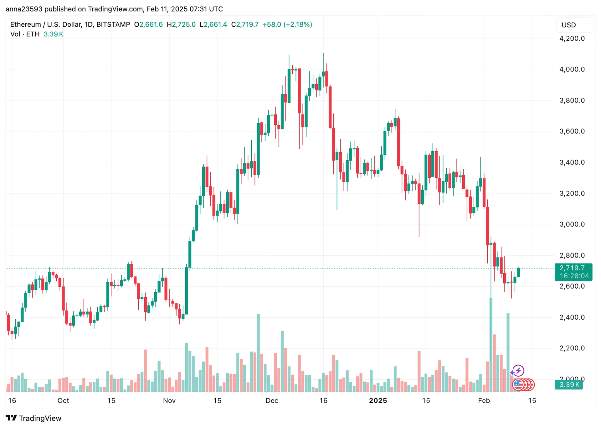
A decentralized exchange (DEX) wants to show Ethereum's price over the last 24 hours. The candlestick chart helps traders see price changes and figure out which way the market is going.
Tools: TradingView, Plotly (Python), Chart.js (Web)
2. Volume Chart – Measuring Market Activity
These charts display the number of assets traded over time, helping users gauge market interest and momentum.
Mathematical Models:
- VWAP (Volume Weighted Average Price) – Measures price movements based on trading volume.
- Cumulative Volume Delta (CVD) – Identifies buying/selling pressure.
📌 Reference on VWAP: https://www.investopedia.com/terms/v/vwap.asp
Design Tips:
- Use green and red bars to differentiate buy and sell volume.
- Add moving averages to help users track volume trends.
- Include hover tooltips showing trade volume for each period.
- Highlight sudden spikes or drops by adjusting bar width or color intensity.
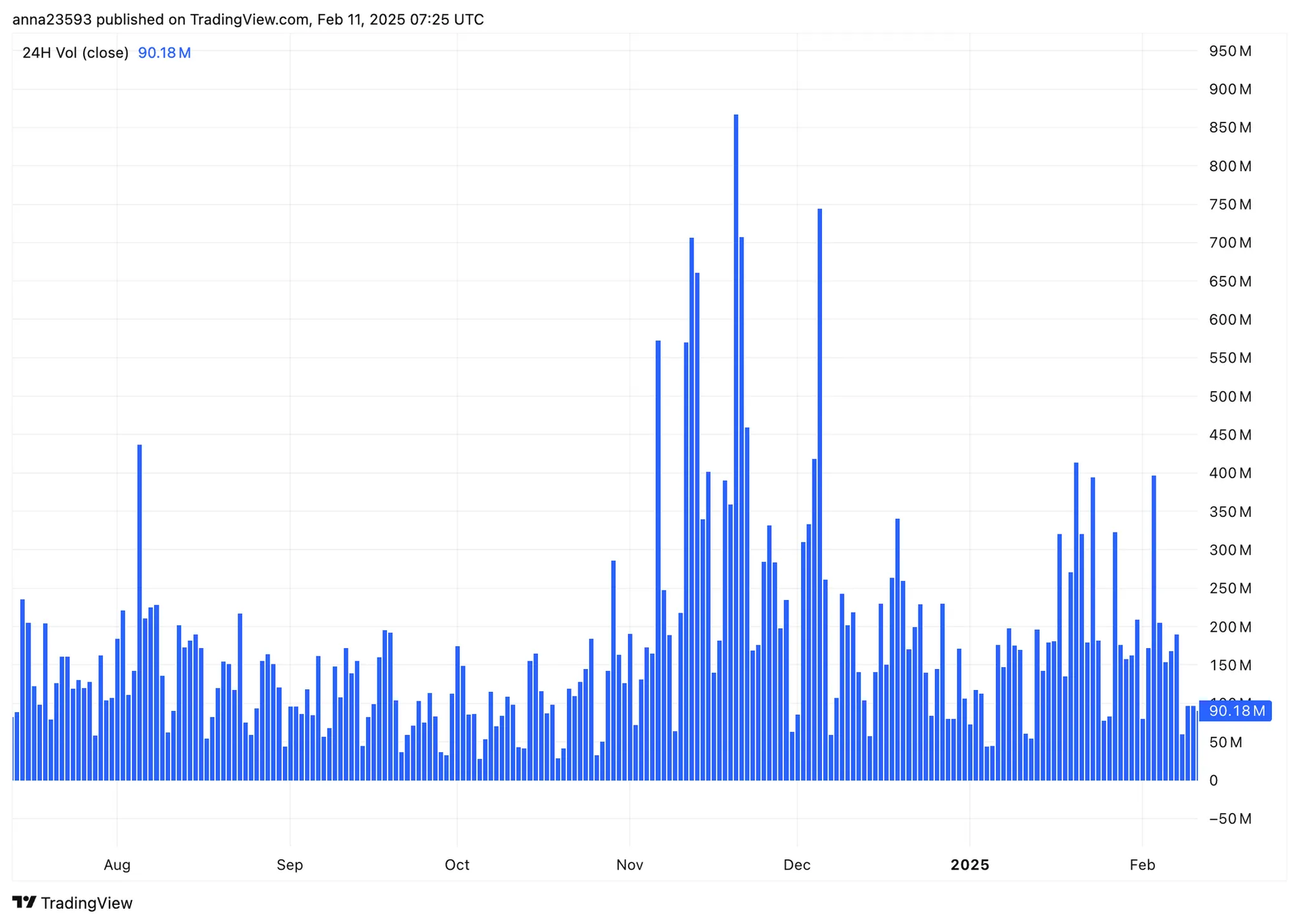
TradingView and Binance use this chart to show real-time trading activity, helping traders understand buying and selling pressure in the market. For example, if Bitcoin's price goes up sharply but trading volume stays low, this could mean the price increase might not last long.
Tools: TradingView, Matplotlib (Python), D3.js
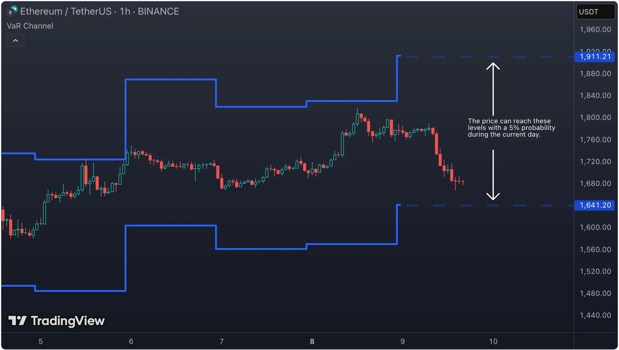
3. Value at Risk (VaR) Chart – Understanding Risk Exposure
VaR charts help traders and investors assess their potential losses within a given time frame.
Mathematical Models:
- Historical VaR – Estimates potential loss based on past data.
- Monte Carlo Simulation – Simulates thousands of risk scenarios.
📌 Reference on VaR: https://www.investopedia.com/terms/v/var.asp
Design Tips:
- Use color-coded risk levels (green for low risk, yellow for medium, red for high).
- Display histograms or line charts for easy comparison.
- Provide clear labels explaining different risk levels.
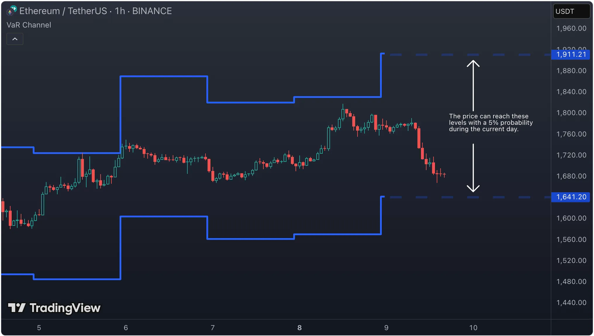
Source: Trading View
The VaR Channel on TradingView helps traders keep track of how much risk they're taking. By picking a time period and probability level, the tool draws upper and lower lines showing where the price might go during that time. This makes it easier for traders to set their stop-loss and take-profit levels based on careful risk analysis.
Tools: TradingView, Seaborn (Python), Matplotlib
4. Efficient Frontier – Optimizing Investment Portfolios
This chart helps investors find the best portfolio with the highest return for a given level of risk.
Mathematical Models:
- Modern Portfolio Theory (MPT) – Markowitz Model – Balances risk and reward.
- Capital Asset Pricing Model (CAPM) – Helps determine expected returns.
📌 Reference on MPT: https://www.investopedia.com/terms/m/modernportfoliotheory.asp
Design Tips:
- Use scatter plots with colors indicating risk levels.
- Add hover tooltips showing portfolio details.
- Allow interactive inputs so users can compare different portfolios.
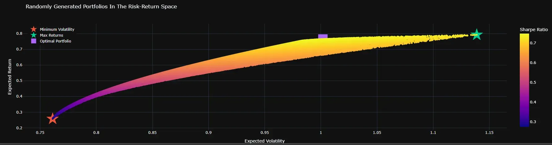
Source: Medium
A discussion about using Modern Portfolio Theory (MPT) for cryptocurrency investments. Looking at the data, the best mix would be 49% ETH and 51% ADA. This shows that while Bitcoin and Ethereum are good for long-term holding, we can also make good returns in the short term with other coins.Tools: Plotly (Python), Tableau
5. Treemap – Understanding ROI and Hierarchical Data
Treemaps show ROI (Return on Investment) across different categories, making it easy to compare sectors or asset groups.
Mathematical Models:
- Squarified Treemap Algorithm – Distributes space efficiently.
- Min-Max Scaling for Color Encoding – Normalizes values for color representation.
📌 Reference on Treemap Algorithms: https://www.cs.umd.edu/~ben/papers/Johnson1991Tree.pdf
Design Tips:
- Use colors carefully—avoid too many variations (green for positive ROI, red for negative).
- Show tooltips with precise details when hovering over sections.
- Provide filters so users can focus on specific areas.
- Allow zooming into categories for better exploration.
Further Reading: https://www.nngroup.com/articles/treemaps/
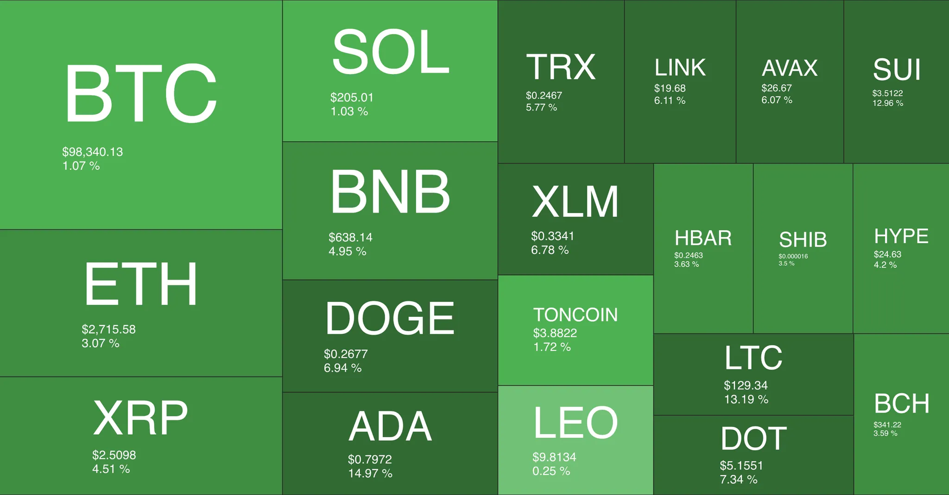
Source: Quantify Crypto
A trading heatmap can show how many trades happen on Ethereum throughout the day. If there's a lot of trading in the afternoon, this might be when big players or computers do most of their trades. An investment flow heatmap can help investment funds see which blockchain is getting the most money.Tools: D3.js, Plotly, Tableau
6. Heatmap Chart - Showing Market Activity Hotspots
Heatmaps show how active trading is and where money flows in the market over time.
Mathematical Models:
- Gaussian Kernel Density Estimation (KDE) - Used to create maps showing where trading happens most.
- Hierarchical Clustering - Groups areas with lots of trading activity.
📌 Learn more about Hierarchical Clustering: https://medium.com/@etoanya/using-hierarchical-clustering-to-cluster-cryptocurrencies-e7c791c170a9
Design Tips:
- Use color gradients to easily show high and low activity levels.
- Add time filters to view different trading periods.
- Include real-time data to track market changes quickly.
- Add hover effects to show details when users mouse over different areas.
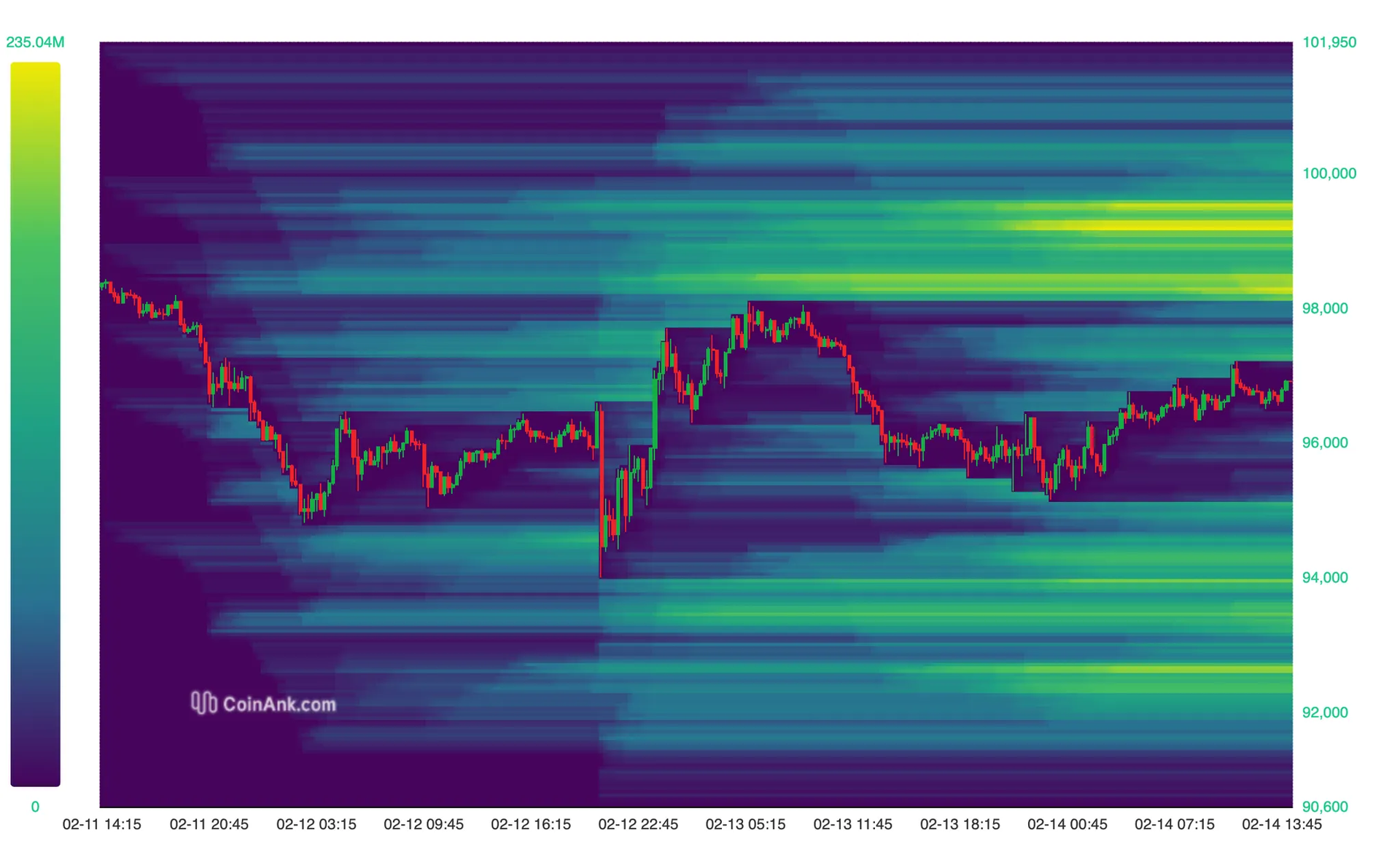
Source: CoinAnk
The liquidation heat map helps traders find areas with high trading activity. By looking at where potential liquidations might happen, traders can guess which way prices might move. This helps them spot support and resistance levels - where "whales" often trade - and understand market pressure to make better trading decisions.Tools: Dune Analytics, Glassnode, CoinAnk, Python (Seaborn, Plotly)
How to choose the right chart for financial design
Key questions to help you pick the right chart:
Before choosing a chart, ask yourself:
👉 “What do I want to show my users?”
- Do I want to track token price movements over time? → Use a Candlestick Chart to show price fluctuations and trends.
- Do I want to see how market capitalization and trading volume are related? → A Volume Chart or Market Cap vs. Volume Chart will help highlight the correlation.
- Do I want to understand how an investment fund allocates its portfolio? → A Treemap provides a clear hierarchical view of asset distribution.
- Do I want to evaluate the growth of a DeFi ecosystem? → A TVL (Total Value Locked) Chart is the best choice for tracking locked assets.
Or you can also choose charts based on these data characteristics:
- Comparison → Bar chart, Line chart, Column chart
- Trends over time → Line chart, Area chart
- Distribution → Histogram, Box plot
- Relationships → Scatter plot, Bubble chart
- Proportions → Pie chart, Donut chart, Treemap
Common Mistakes in Financial Data Visualization:
- Using too many colors or complex designs that make it hard to understand the information
- Missing clear labels or titles that make the data meaningless
- Forgetting important notes that help explain what the chart means
Conclusion
A great Product Designer doesn't just visualize data—they make it clear, actionable, and easy to use. When working with trading and finance products, understanding mathematical models isn't about writing formulas yourself, but rather knowing how to pick and design charts that show data in the clearest and most understandable way. Good design helps users not only read data faster but also understand market trends, assess risks, and make better investment decisions.
SHARE THIS ARTICLE